WARMACHINE WEDNESDAY: New Look & New Subscriber Scenario!

Quick reminder that the Warmachine Community Survey is still live! We’ve had an excellent response so far and every submission counts. Fill out the survey here. For more details, check out this post.
Wednesday has arrived, which means it’s time for your weekly drop of new content and features in the WARMACHINE app!
But before we get into that…
New Look
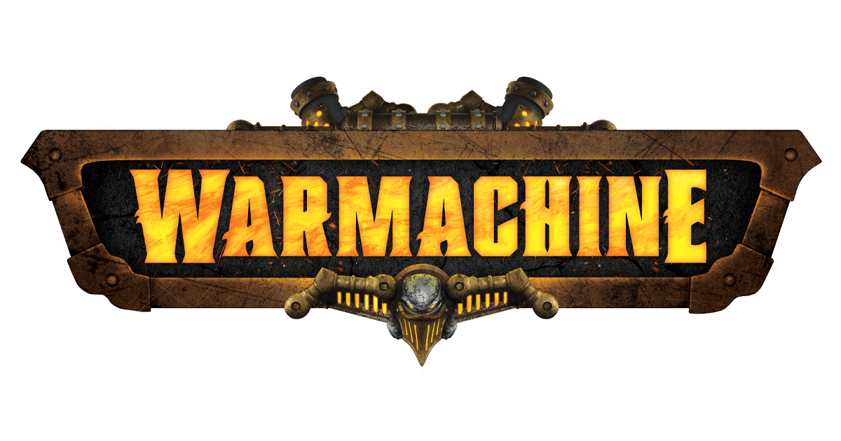
Let’s start with the updated logo

The logo needs to pass the ‘squint test’, which means it has to be easily read and recognized from a distance.
The new design inherits the serif but makes the lettering stronger and more defined, with more consistent kerning (letter spacing) across the logo. This meant we could reduce the overall logo height without detracting from its presence.
At a detail level, we’ve adjusted the ‘struts’ on the warjack element to sit within and support the logo, instead of leading the eye down and away. From a practical perspective, there’s a subtle rim of lighting to help it stand out against multiple backgrounds.
In short, it’s close to the old logo, but it’s more compact, legible, and powerful.
Onto the packaging…

Here, we’ve introduced contrasting, two-tone backgrounds based on faction. Not only does this build faction identity, but it also helps to ‘slay the grey’ in cases where the models aren’t yet fully painted.
Speaking of models, we’ve moved away from the traditional lineup to a more dynamic, in-situ style grouping that focuses on the warcaster or warlock.
You’ll also notice a QR code on the front of each box. That will link through to a dedicated landing page to give you clarity on exactly what’s in the box, how it relates to other sets, and the army as a whole.

On the back of the box, we’ve introduced the iconic Magnus artwork (which is more visible on some boxes than others), that’s more inline with our target aesthetic and has an on-point color palette.
We’ve also introduced more structure to the layout, simplified the overall palette, and cleaned up the graphic elements to reduce competition for your attention, so players can more easily focus on key information.
 We’re also updating the branding in the Warmachine app (preview below) and will be rolling it out across our website over the next several days.

There’s a bounty of treasure to be found if you’re savvy enough to retrace the steps of him who stole it and shrewd enough to stay out of the crosshairs of him it was stolen from!
Players race to find a hidden treasure by following a series of clues to various points on the map. Only the player who secures a clue knows the location of the next clue, however, giving those practiced in the art of deception a possible edge over those who merely charge straight for the next objective.
And then, there are no additions, corrections, or other changes to the app this week!
And that’s it for now. Tune in next week for even more subscriber-only content!


